Contract Version Comparison

April 15, 2026
Outcomes
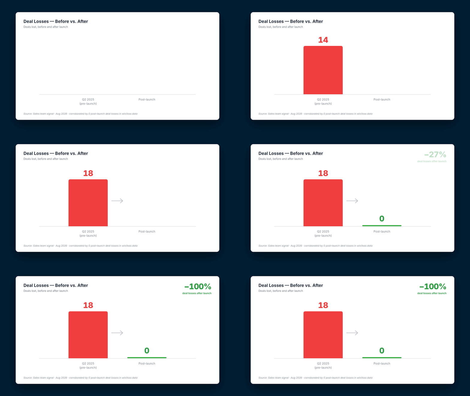
Deal losses: 18 → 0
223 orgs and 387 users in 6 months
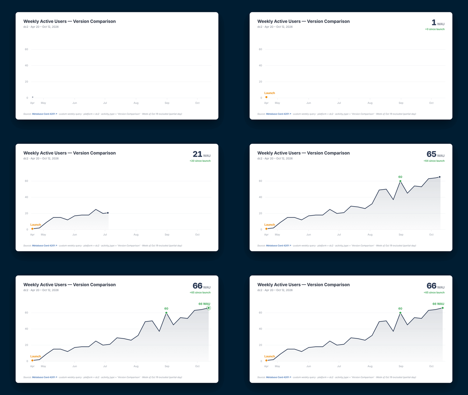
Weekly active users up to 66
My roles

UX, UI, Research, Prototyping, Motion

Opportunity

How might we help legal and estimating teams see what changed between contract versions, and what it means for their risk, without leaving their review workflow?

Solution

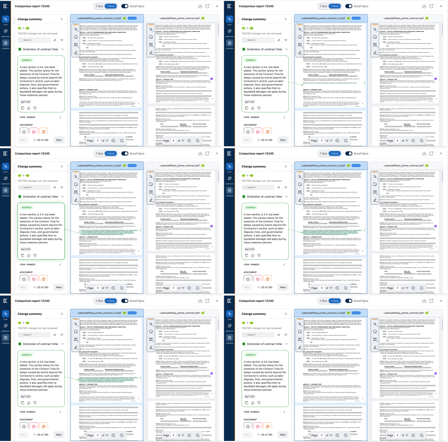
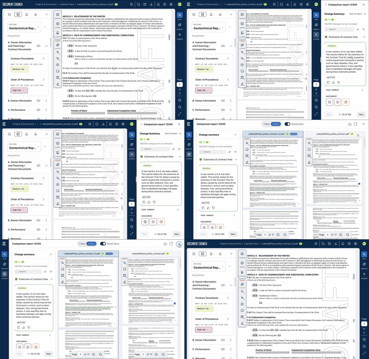
Allow users to store every version in one place, side-by-side views with AI change summaries, and a portable comparison panel that works in doc-view or in chat.

Project summary

Document Crunch helps construction teams review contracts for risk. In 1.0, users could compare only two versions, with no side-by-side view and no easy way to share. That gap was the top reason cited in Q2 2025 deal losses: 18 deals and a claimed $3.4M in ARR.

Timeline

2 cycles, Feb–May 2026

Outcomes

Six months after launch, deal losses citing the missing feature fell from 18 to zero, and sales now cites it as a win reason.

Adoption: Weekly active users grew to 66 in 6 months, with 387 users across 223 orgs running 1,825 comparisons.
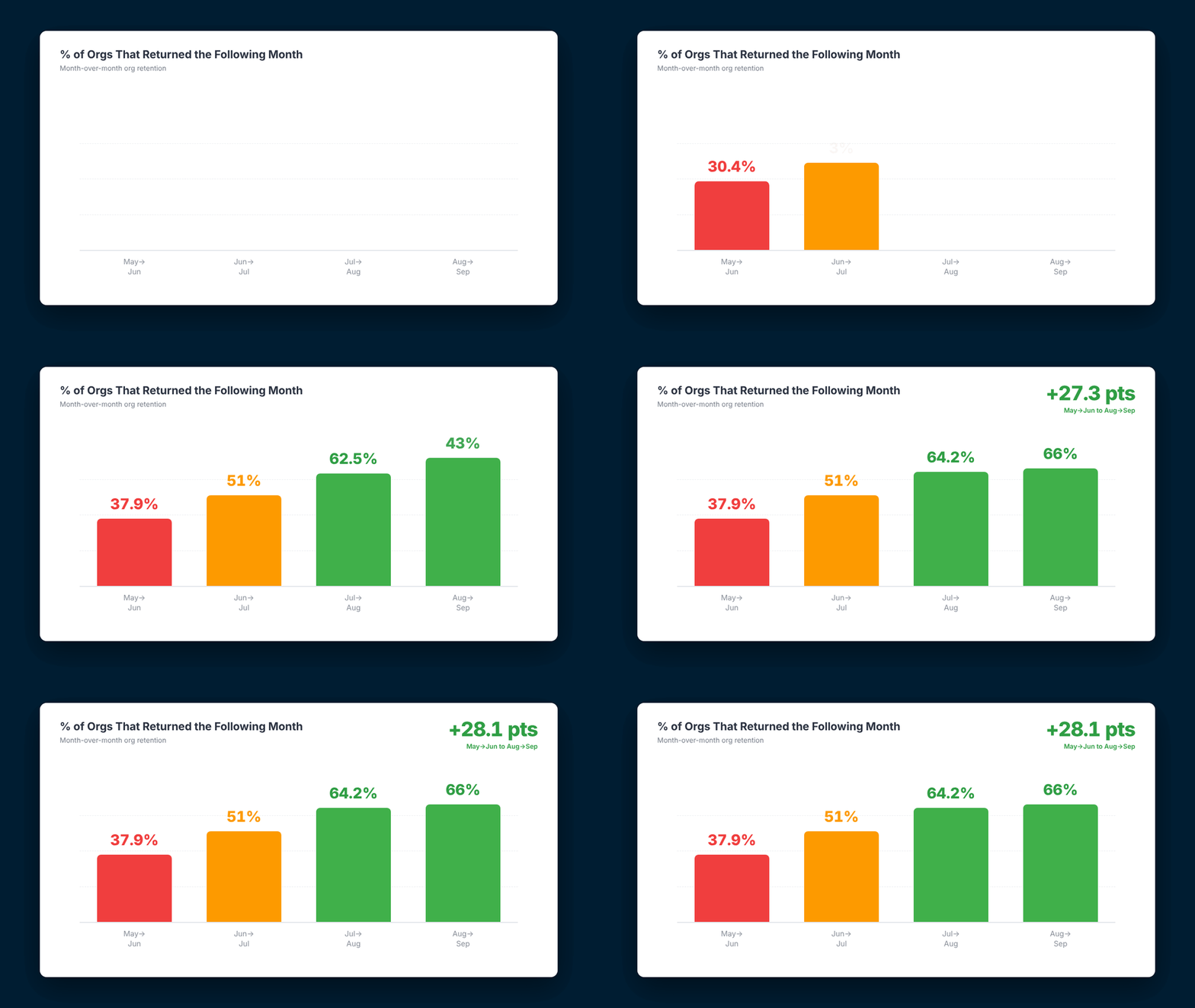
Growth and retention: 27 to 47 new orgs joined each month from May to September. Month-over-month org retention rose from 38% to 66%.
"This is exactly what we needed — seeing two versions side by side makes it so much faster to understand what changed in an amendment." — Five S Group

"The version comparison feature has been a game changer for our team. We used to spend hours manually tracking changes across amendments." — Briggs Electric
How was it done?

Two cycles with Pod 2, each ending in a company demo.

  • 1.0 signals inform prioritization
    • Side-by-side (100% requested)
    • More than two versions (80%)
    • Markups
    • Sharing without downloads
  • Personas: A GC legal counsel tracking accepted and rejected changes, and a trade estimator spotting spec changes that affect a quote. Shared goal: mitigate risk.
  • Cycle 4: All versions in one crunch, with a side-by-side compare that also works in chat. I prototyped it in Figma and started a five-session user test.
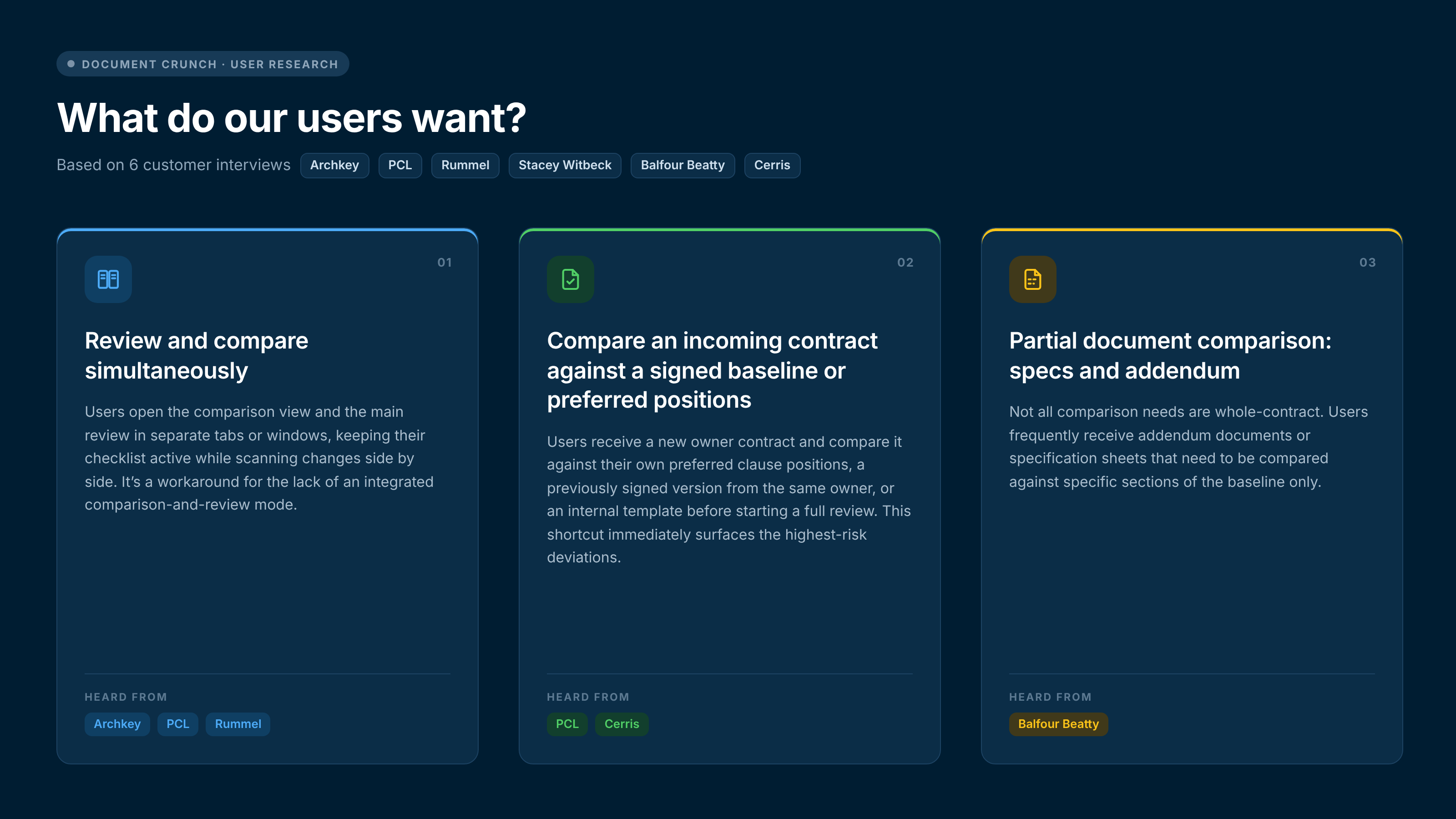
  • Customer interviews: Six interviews (Archkey, PCL, Rummel, Stacey Witbeck, Balfour Beatty, Cerris) showed users compare alongside their checklist, against a signed baseline, or one addendum at a time.
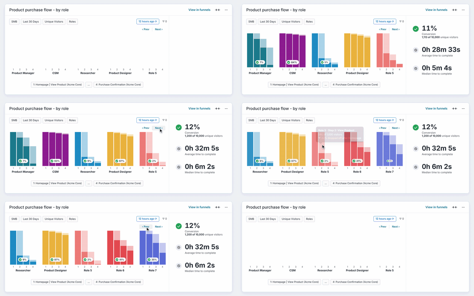
  • Cycle 5: I redesigned comparison as a slide-out that launches anywhere, keeping users in their task, and built motion studies for handoff.
  • Sharing: An exportable report lists each change by type with an AI summary and before/after text.
Surprise win

Built to stop deal losses, it became a reason to win them. The portable component is also reusable across the app, including chat.
Challenges
  • Habit: Users were used to 1.0, so the new version-then-compare flow needed clear entry points.
  • Context switching: 59.5% of 1.0 users clicked back to v1 or their checklist after viewing v2.
  • Partial comparison: Estimators often compare one addendum, not a whole contract.
  • Depth: The median user runs about 2 comparisons a month, and two customers found the change report hard to read.
Design decisions
  • All versions in one crunch, not a two-file upload.
  • Side-by-side view with AI summaries, so users can verify the AI.
  • A portable slide-out that opens from a crunch or chat.
  • The checklist stays in view while comparing.
  • A shareable report instead of downloading every file.
Collaborations

Six design review and discovery sessions (Feb–Apr 2026) with the pod and partners shaped how comparison connects to redlines and project-level reviews.

With Courtney (PM), I tied the work to three outcomes: spot new risks, save time while earning trust, and grow users per account. With Kaleb (EM) and engineering, I made comparison one reusable component for both crunch and chat.

User research and testing

Five moderated tests on the Cycle 4 prototype and six customer interviews found that:
  • Side-by-side was the clear favorite.
  • Comparison should tie to the risk review.
  • Users review and compare at the same time, which led to the context-keeping slide-out.
  • Teams compare against a signed baseline or preferred positions to find the riskiest changes first.
What's next

The next goal is depth: moving users from about 2 comparisons a month to 4–6, with org retention steady above 65%. After a customer rated the change report 1 out of 5, I followed up with them directly and drafted a pitch:

  1. Redesign the change report so the before and after read at a glance, and test it in three sessions.
  2. Surface comparison when a new amendment arrives.
  3. Partner with engineering on accuracy, since one wrong result costs trust.

Process

Yes, the dreaded coming soon...

Visual designs

No items found.

More projects

Never stop learning
Whenever I have some time, which isn't often as a father, I like to learn something new. Here are some of my latest certificates.